Your website has 50 milliseconds to prove you're credible. Not 50 seconds. Fifty milliseconds.
That’s not a metaphor, it’s validated research. Carleton University and Google confirmed users form aesthetic judgments in 17–50 milliseconds. For cybersecurity brands, that microsecond perception becomes a make-or-break trust test. Your visual system isn’t decoration, it’s your credibility infrastructure.
According to the Stanford Web Credibility Project, 46.1% of credibility assessments come down to how your site looks. Before anyone reads your SOC 2 compliance badge or checks your certifications, they have already decided whether you’re trustworthy. With cybercrime costs reaching $10.5 trillion annually, visitors don’t have patience for sites that look careless or inconsistent.
This guide synthesizes research from Nielsen Norman Group, Baymard Institute, Stanford’s Persuasive Technology Lab, and W3C standards to show how design builds or breaks trust in cybersecurity. This isn’t about making things “pretty.” It’s about designing credibility, creating intuitive trust systems, and aligning your visual presence with your security promise.
What happens in the first 50 milliseconds?
A visitor’s first impression isn’t a decision. It’s a reflex.
Dr. Gitte Lindgaard’s team at Carleton University proved that visual appeal assessments made in 50 milliseconds correlate strongly with those made after 500 milliseconds. The conclusion: your audience knows how they feel about your brand before they know why.
For cybersecurity brands, that physiological response defines the outcome of every later interaction. A visually disorganized interface doesn’t just look unprofessional, it signals potential carelessness in your security posture.
This aligns with Daniel Kahneman’s dual-process theory. System 1 (fast, intuitive) makes immediate aesthetic judgments, while System 2 (slow, deliberate) rationalizes them later. When your System 1 impression fails, your content has to work ten times harder to regain credibility.
In a field where buying cycles stretch 6 to 18 months and involve multiple stakeholders, that first half-second matters. You don’t get to build trust gradually. You either have it instantly, or you start every interaction behind the curve.

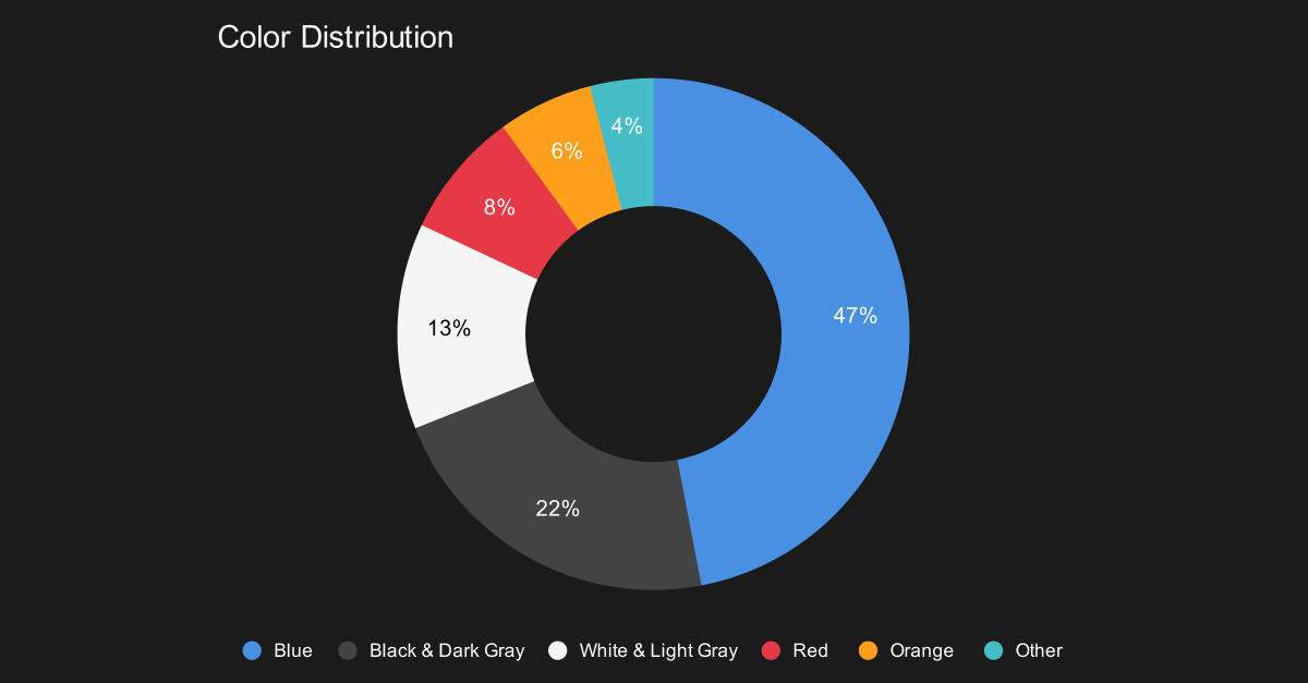
Why do cybersecurity sites all look blue?
Walk through any cybersecurity conference and you’ll be surrounded by blue logos. That’s not coincidence, it’s cultural code.
Blue dominates for measurable reasons. 57% of business leaders rank trust and credibility as the most important messaging factor in cybersecurity. Blue signals reliability, security, and control, values IBM embedded into tech identity when it became known as “Big Blue” in the 1970s.
But blue doesn’t have to mean boring. Leading security brands use color strategically:
- CrowdStrike breaks convention with signature red for instant recognition.
- Palo Alto Networks balances energy with authority through orange and black.
Typography plays an equally critical role in trust formation. Serif fonts convey tradition and authority, ideal for established enterprises. Sans-serif fonts project modernity and accessibility, common among innovators and SaaS leaders. Consistent typography can increase engagement by up to 30%.
When should you follow the blue pattern?
If your audience is risk-averse or procurement-focused, lean into blue’s visual shorthand for credibility. It establishes a safe, professional baseline that earns attention from cautious buyers.
When should you break convention?
If your advantage lies in innovation, differentiation, or thought leadership. Breaking the blue pattern visually signals confidence and originality, especially when paired with clarity, contrast, and clean hierarchy.
The question isn’t whether to use blue. It’s whether blue communicates your story.
Blue dominates cybersecurity branding, signaling trust and stability, while darker neutrals and warm accents define differentiation.
Which design patterns actually work in 2025?
Forget the design trends dominating Dribbble. What matters is what users trust.
Why do card-based layouts dominate?
Card-based layouts have become the backbone of modern cybersecurity sites because they balance complexity and clarity. They organize dense technical content into digestible, scannable sections while maintaining hierarchy and rhythm. CrowdStrike, Okta, and SentinelOne all use this pattern to communicate both scale and precision.
Are mega menus worth the effort?
Yes, when done right. Mega menus simplify complex navigation by revealing key categories in a single view, helping users find relevant content quickly. The pitfall is overstuffing them. Keep top-level navigation to 5–7 items maximum, with descriptive labels (for example, “Solutions by Role” is clearer than “Products”).
Should cybersecurity sites use dark mode?
74% of enterprise software includes dark mode, and 82% of mobile users prefer it. Dark themes resonate with cybersecurity’s aesthetic of control and focus. But context matters. Financial institutions often retain light interfaces for clarity and confidence. The right choice depends on your user’s daily environment.
The design implication? Dark mode isn’t a trend. It’s an accessibility and fatigue consideration. Choose it only when it improves legibility and comfort, not because it looks trendy.
How much motion is too much?
Motion design should inform, not entertain. Micro-animations increase engagement by 15% when they reinforce clarity, such as confirming form completion or guiding the eye toward key elements. Overuse erodes trust, creating the sense of instability that contradicts your brand’s security message.

How do you turn visitors into qualified leads?
Conversion design is where trust becomes measurable. Every field, label, and badge on your form influences how users perceive your operational maturity.
What’s the optimal number of form fields?
No more five fields! Reducing from four to three fields can increase conversion by 50%. Every unnecessary field feels like friction. If you can gather it later, don’t ask for it now.
Do multi-step forms actually work better?
Yes. Multi-step forms convert 86% higher than single-page forms. Breaking long forms into smaller sequences lowers perceived effort and increases commitment. Once a user starts, they’re significantly more likely to finish.
Which form design choices have the biggest impact?
- Single-column layouts complete 15 seconds faster than multi-column
- Inline validation reduces errors by 22% and completion time by 42%
- Radio buttons outperform dropdowns by 2.5 seconds per interaction
- Progress indicators boost completion by 20–30%
Which form fields destroy conversions?
- Password: 10.5% abandonment
- Phone number: 37% abandonment (fix this by making it optional)
- Email: 6.4% abandonment
Streamline ruthlessly. The goal isn’t collecting data, it’s building momentum toward trust.
Where should you place trust signals?
Keep trust visible where decisions happen. SOC 2 or ISO 27001 badges, client logos, and security certifications should live within the same visual field as CTAs, not buried in the footer. Baymard Institute’s research shows 42% conversion improvement when badges appear near forms.
Is accessibility just about compliance?
Accessibility isn’t a legal checkbox. It’s a trust signal that reflects care and competence.
95.9% of homepages have detectable WCAG failures with an average of 56.8 errors per page. The top issues, low contrast, missing alt text, and absent form labels, are simple to fix yet costly to ignore.
If your site doesn’t pass basic accessibility tests, users subconsciously question your attention to detail. That perception bleeds into how they evaluate your technology.
What makes GDPR consent actually compliant?
To be valid, consent must be:
- Freely given (Accept and Reject equal prominence)
- Specific (clear on what’s collected and why)
- Informed (readable and transparent)
- Unambiguous (no forced paths or dark patterns)
Most privacy notices require a grade 12 reading level while your average visitor reads at grade 8. Solve that with layered summaries and plain-language visuals that respect user agency.
Accessibility and privacy done right become trust advantages. Done poorly, they quietly erode credibility.
What content strategy actually works for cybersecurity?
Your audience doesn’t want volume, they want relevance. Strong content strategy aligns message, timing, and trust stage.
What’s the ideal length for blog content?
1,500–2,500 words is the sweet spot for authority and readability. But structure matters more than length. Use concise paragraphs, subheads phrased as questions, and key terms bolded for scanning. Write for reading ease, not algorithmic density.
Do videos increase conversions?
Absolutely. 87% of B2B marketers use video, and 88% report positive ROI. For cybersecurity brands, product demos and customer interviews perform best. Including video on landing pages can boost conversions by 80%+.
Focus on showing, not telling, how your product reinforces confidence. And prioritize LinkedIn for distribution, where 43% of B2B buyers engage with industry video content.
Why do case studies outperform everything else?
Because they prove it works. 79% of B2B buyers read case studies before engaging sales. The formula is simple:
- The problem your buyer recognizes
- The solution your team implemented
- The results you can measure
Quantify everything. Replace “improved security posture” with “reduced breach response time by 47%.”
How critical is mobile optimization?
While 83% of B2B traffic originates on desktop, 40% of total revenue now involves mobile touchpoints. Executives read, forward, and share content on mobile devices after hours. A frictionless mobile experience extends your influence far beyond business hours.
How are AI and zero-trust changing user experience?
AI and zero-trust are redefining what users expect from secure design. Artificial intelligence personalizes digital experiences in real time, while zero-trust architecture reshapes how users access and interact with data. This demands seamless, secure, and adaptive UX.
Is AI personalization ready for cybersecurity?
72% of organizations use AI in at least one business function, but only 26% report measurable value. Success depends less on algorithms and more on how you design for human behavior.
The 10-20-70 rule defines successful AI adoption: 10% algorithms, 20% data, 70% people and processes.
The takeaway? Don’t chase personalization for its own sake. Use AI to enhance clarity, adaptive dashboards, guided onboarding, or predictive content surfacing, not to overcomplicate navigation.
What does zero-trust mean for UX?
Zero-trust architecture’s principle, “never trust, always verify,” demands frictionless security. Implement seamless verification:
- Single Sign-On (SSO) for reduced repetition
- Biometric authentication for intuitive verification
- Risk-based adaptive authentication that adjusts dynamically
Design goal: keep protection visible but invisible in experience. Users should feel secure without being reminded of security every second.
Is passwordless authentication ready?
The decentralized identity market is growing from $4.89B in 2025 to $41.7B by 2030. Biometrics now account for 63.8% of that growth.
Emerging standards like FIDO2 and W3C’s Verifiable Credentials are redefining authentication flows. Replacing “enter password” with “look at your phone” is no longer novelty, it’s expectation. If your login feels dated, so does your credibility.
How does Prompt Digital design for trust?
Every cybersecurity website we create starts with one assumption: design is security made visible.
We begin with a research audit that analyzes competitors, behavior patterns, and trust cues in your category. Then we align insights through a design workshop that translates data into brand direction before a single pixel moves.
From there, we implement:
- Trust signal architecture designed for instant credibility.
- WCAG-compliant frameworks built from inception.
- Measurable UX benchmarks tied to real conversion data.
- Behaviorally validated layouts refined through testing.
Our work with Cyera reflects this philosophy. Their redesigned site balanced sophisticated minimalism with visible trust indicators, showing how security brands can stand out without sacrificing seriousness.
The design implication? Credibility is earned in pixels, proven in performance, and sustained through evolution.
What defines the best cybersecurity websites in 2025?
Across all high-performing security brands, consistent patterns emerge:
Visual systems that build trust
Blue-dominant palettes with intelligent accent color. Typography balancing precision and warmth. White space structured to feel intentional, not empty.
Conversion-optimized architecture
Card-based layouts, clean mega menus, and concise multi-step forms with visible trust signals.
Accessibility as a feature, not a fix
WCAG 2.2 compliance, equitable GDPR consent, and readability that respects user cognition.
Technical excellence
Real-time trust centers, optimized Core Web Vitals, and semantic structured data for AI visibility.
Strategic content
Case studies with quantified results. Educational posts that answer real buyer questions. Video stories that humanize complex technology.
What separates great sites from expensive digital brochures?
Companies strong in design outperform peers by nearly 2x revenue growth (McKinsey Design Index). Yet 90% of organizations fail to realize full design potential.
In cybersecurity, the difference between a site that converts and one that confuses is clarity, structure, and discipline. 61% of B2B purchase decisions begin with web search, and 68% of buyers prefer to research independently. Your website isn’t collateral, it’s your credibility engine.
Stanford’s research still stands: 46% of trust judgments are based on design look. Nielsen Norman Group confirms it: “The basic factors used to weigh trustworthiness remain constant across culture and time.”

What does this mean for you?
Design is no longer a surface, it’s a signal. Your website is your first proof of competence, your most visible product demo, and your quietest salesperson.
Brands that win in cybersecurity combine validated trust principles with adaptive technologies. They don’t follow trends; they translate trust into design systems that evolve as fast as the threats they defend against.
Ready to turn design into your trust advantage?
Prompt helps cybersecurity brands build websites that don’t just look credible, they prove it. We translate behavioral research into measurable results across trust, conversion, and long-term engagement.
Let’s audit your current trust experience, identifying specific friction points where design becomes competitive advantage, not operational cost.

Daniela Aranaga
Daniela keeps Prompt running with clarity and momentum, managing internal operations, optimizing workflows in ClickUp, and leading the team’s social media presence. A SearchAtlas expert fluent in SEO and AEO best practices, she connects process and performance to keep every system, and story, aligned.

The Prompt Team
The Prompt Team is our collective of designers, developers, and strategists translating real project experience into clear, useful insights. Each article reflects our team’s combined expertise, a practical approach to helping brands navigate digital design, strategy, and growth with confidence, clarity, and purpose, built on years of collaboration, curiosity, and hands-on results.